
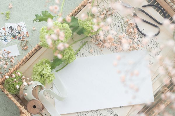
Wedding invitations do more than share a date, time, and venue. They quietly introduce the feeling of the wedding before guests ever arrive. A soft cotton card can suggest romance and tradition. A smooth, bright white sheet can feel clean and modern. A textured handmade paper might hint at an intimate garden celebration or a weekend in the countryside.
That is why learning how to choose wedding invitation paper matters more than many couples first realize. The paper is not just a surface for words. It affects the way the invitation looks, feels, photographs, mails, and even how formal it appears. You do not need to become a paper expert, but understanding the main options can help you make a choice that feels thoughtful rather than random.
Why Wedding Invitation Paper Matters
The paper sets the tone before the design fully speaks. Guests notice weight, texture, and finish, even if they do not use those exact words. A flimsy card may make a formal black-tie invitation feel less polished, while an overly heavy or ornate paper might feel too serious for a relaxed beach wedding.
Paper also affects printing. Some paper types hold ink sharply, while others absorb it in a softer, more romantic way. Foil stamping, letterpress, digital printing, embossing, and watercolor designs all behave differently depending on the stock. So, when choosing paper, you are really choosing both style and function.
There is also the practical side. Thick paper often feels luxurious, but it can increase postage costs. Handmade paper looks beautiful, but it may not be ideal for every printing method. Glossy finishes can make colors pop, yet they may not suit a classic or understated design. The best paper is the one that balances beauty, budget, printing needs, and the overall mood of the wedding.
Start With the Style of Your Wedding
Before comparing paper weights and textures, think about the atmosphere of your wedding. Is it formal, relaxed, romantic, rustic, modern, traditional, or playful? The paper should feel like it belongs to that world.
For a ballroom wedding, a thicker smooth card, cotton paper, or pearl-finish stock can feel elegant and refined. For a garden wedding, textured paper, soft matte stock, or deckle-edge handmade paper may feel more natural. A beach wedding often works well with lighter, airy paper in soft neutral or coastal tones. A city wedding might suit crisp white paper with a clean matte finish.
This does not mean everything has to match perfectly. Sometimes contrast works beautifully. A simple invitation on rich cotton paper can look stunning for a modern wedding. A minimalist design on handmade paper can feel fresh rather than old-fashioned. Still, the paper should support the feeling you want guests to have when they open the envelope.
Understand Paper Weight and Thickness
Paper weight is one of the first things people ask about, and for good reason. It affects how the invitation feels in the hand. Heavier paper usually feels more substantial and formal, while lighter paper can feel simpler and more casual.
Wedding invitation paper is often measured in pounds or grams per square meter, depending on the supplier. A common invitation card might fall somewhere around 100 lb to 130 lb cover stock, while premium invitations may go heavier. Thick cards are especially popular for letterpress, foil stamping, and luxury invitation suites because they can hold impressions and finishes well.
However, heavier is not always better. Very thick paper can be harder to fold, may not work with certain home printers, and can raise mailing costs. If your invitation suite includes multiple cards, envelopes, liners, ribbons, or wax seals, the final weight can add up quickly. It is wise to request samples and, if possible, weigh the full invitation before mailing.
Choose the Right Finish
The finish is the surface quality of the paper. It influences both appearance and touch. Matte paper is one of the most popular choices for wedding invitations because it feels elegant, soft, and easy to read. It does not reflect much light, which makes it suitable for classic designs, modern typography, and gentle color palettes.
Glossy paper has a shiny surface and can make colors appear brighter. It is more common for photo-heavy designs, though many couples avoid it for formal invitations because it can feel less timeless. Satin or silk finishes sit somewhere between matte and glossy. They offer a slight sheen without looking too reflective.
Pearlescent paper has a subtle shimmer, which can be lovely for evening weddings, winter celebrations, or romantic designs. Still, it should be used carefully. Too much shine can distract from the wording or make the design feel busier than intended.
Then there is textured paper. Linen, felt, laid, and handmade textures give invitations depth and character. These papers are especially good when the design is simple because the texture itself becomes part of the visual story.
Think About Printing Methods
The printing method you choose can guide your paper decision. Digital printing is flexible and works well on many smooth or lightly textured papers. It is often chosen for colorful artwork, watercolor designs, and modern invitation suites.
Letterpress requires thicker, softer paper because the design is pressed into the surface. Cotton paper is a favorite for this style because it creates a deep, elegant impression. Foil stamping also works best on sturdy paper that can handle pressure and heat. If the paper is too thin or too textured, the foil may not appear as clean.
Embossing and debossing need enough thickness to show detail clearly. Thermography, which creates raised ink, usually works better on smooth paper. If your design includes fine lines, small type, or delicate script fonts, a smoother paper may keep everything crisp and readable.
This is one reason samples are so helpful. A paper might look beautiful on its own but behave differently once printed.
Consider Color Carefully
White and ivory are classic for a reason. They are versatile, readable, and easy to pair with most wedding themes. Bright white often feels clean and modern. Ivory feels warmer and more traditional. Cream or off-white can soften the design and work beautifully with gold, brown, sage, blush, or dusty blue accents.
Colored paper can be striking, especially for modern or moody weddings. Deep green, navy, black, terracotta, and dusty rose papers can create a memorable invitation. But darker paper usually requires special printing methods, such as white ink, foil, or letterpress, because standard ink may not show clearly.
If you are using colored envelopes, liners, or belly bands, the invitation paper does not necessarily need to be colorful too. Sometimes a neutral card paired with a rich envelope gives the perfect amount of personality without making the suite feel heavy.
Match Paper to Your Invitation Suite
Your main invitation is only one part of the suite. There may also be RSVP cards, detail cards, maps, menus, programs, place cards, and thank-you cards. These pieces do not all have to use the exact same paper, but they should feel connected.
A common approach is to use heavier paper for the main invitation and slightly lighter stock for insert cards. This keeps the suite elegant while managing weight and cost. You can also create contrast by mixing textures, such as a smooth main card with a vellum overlay or a handmade paper detail card.
Vellum is often used as an accent rather than the main invitation. It has a translucent look that feels soft and layered. It can be beautiful over floral artwork or minimalist typography, though it may need special handling because ink can smudge if not printed properly.
Keep Budget and Postage in Mind
Paper can have a big impact on the final cost of wedding invitations. Premium cotton, handmade paper, thick stock, specialty finishes, and custom colors usually cost more than standard matte cardstock. That does not mean you need the most expensive option to create a beautiful invitation.
A simple design on good-quality matte paper can look more elegant than a complicated design on the wrong stock. If budget is tight, prioritize the main invitation card. You can choose a better paper for that piece and use simpler stock for inserts. You can also skip extras that add weight, such as heavy liners or bulky embellishments.
Postage is easy to overlook. Square invitations, oversized cards, thick envelopes, wax seals, and heavy suites may require extra postage. Before sending everything out, take one fully assembled invitation to the post office and confirm the correct mailing cost. It is a small step, but it can prevent delays and returned envelopes.
Always Order Samples First
Paper is difficult to judge from a screen. Color, texture, and thickness can look very different in person. A paper described as “soft white” may appear creamier than expected. A texture that looks subtle online may feel too rough for your design. A thick card may feel perfect, or it may seem heavier than you wanted.
Ordering samples allows you to touch the paper, test colors against it, and see how it fits with your wedding palette. If you already have fabric swatches, ribbon samples, flowers, or mood board images, compare them with the paper. These small details help the invitation feel connected to the rest of the wedding.
If you are working with a stationer or printer, ask which paper they recommend for your chosen printing style. Their advice can save you from pairing the wrong stock with the wrong technique.
Choose Paper That Feels Like Your Wedding
The best advice on how to choose wedding invitation paper is to think beyond trends. Thick cotton paper, handmade edges, vellum wraps, and pearl finishes all have their place, but none of them are right for every wedding. The right paper should feel natural for your celebration, your wording, your colors, and your budget.
Ask yourself what you want guests to feel when they hold the invitation. Formal and polished? Warm and romantic? Fresh and modern? Soft and personal? Once you know that, the paper choice becomes much easier.
Conclusion
Wedding invitation paper may seem like a small detail at first, but it shapes the entire invitation experience. It affects the texture, weight, color, printing style, and first impression of your wedding stationery. Choosing well does not mean choosing the most expensive paper. It means choosing paper that supports the mood of your day and makes the design feel complete.
When you take time to compare finishes, weights, colors, and printing methods, the invitation becomes more than a card. It becomes the first quiet glimpse of the celebration ahead. And that is exactly what good wedding stationery should do.