

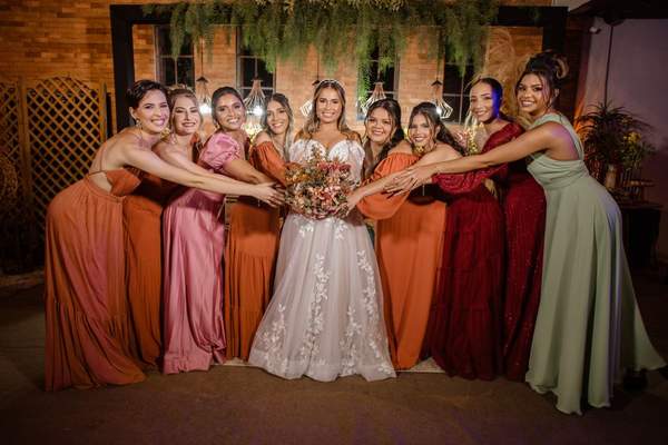
Choosing bridesmaid dress colors sounds simple until you compare the dresses with the venue, flowers, and wedding photographs. A shade that looks perfect on a mood board may disappear against the ceremony backdrop or appear very different in satin and chiffon. The aim isn’t to find one universally flattering color. It’s to create a wedding party color palette that feels intentional and makes the people wearing it comfortable.
Before settling on sage, dusty blue, champagne, or another favorite, consider the setting as a whole. These decisions will help you narrow your options without getting lost in endless swatches.
Begin With the Mood, Not a Trend
Choose three words to describe your celebration: perhaps relaxed, romantic, and airy, or dramatic, modern, and formal. They provide a more reliable starting point than this year’s most photographed shade. A garden wedding might call for softened colors, while an evening ballroom celebration can comfortably carry deeper tones.
Identify what’s already fixed: the venue, ceremony backdrop, floral direction, and the couple’s outfits. At a location with terracotta walls and warm timber, olive or dusty rose may sit more naturally than icy lavender. Nothing must match exactly, but each element should look as though it belongs.
Pay Attention to the Venue and Lighting
Look behind the wedding party
Think about where everyone will stand for the ceremony and group portraits. Forest-green dresses against dense foliage can blend into the background. Very pale dresses against cream stone might lack definition, too. Aim for enough contrast that the group remains visible.
Coastal settings can suit muted blue, sand, and sea-glass green. In a ballroom with patterned wallpaper or carpeting, one restrained dress color can give the photographs a welcome visual pause.
Test the light you will actually have
A fabric swatch may look peach in afternoon daylight but distinctly pink under warm reception lights. View samples outdoors in shade, beside a window, and under indoor lighting similar to your venue’s. Color also depends on fabric sheen and camera settings, so ask your photographer about the portrait location and timing.
Take Cues From the Season Without Being Ruled by It
The best bridesmaid colors aren’t necessarily the predictable shades for a particular month. Seasonal ideas are useful starting points, not restrictions.
Spring and summer
For spring, consider soft lilac, blush, dusty blue, or fresh green. Summer can support coral, muted teal, butter yellow, or vibrant berry. Lighter fabrics often suit warm-weather celebrations, but check whether they become too sheer in bright daylight.
Autumn and winter
Rust, olive, burgundy, and warm taupe can complement autumn scenery. Winter celebrations often suit emerald, navy, plum, charcoal, or wine. Pale neutrals can work in winter as well, especially alongside textured bouquets and deeper accents. The backdrop matters more than the calendar.
Build a Palette, Not a Collection of Random Favorites
For easier dress color coordination, begin with one dominant color family, one supporting shade, and a neutral. Those colors needn’t all appear in the dresses. Sage dresses, for example, might be accompanied by ivory flowers and antique-gold details.
Mismatched dresses can look equally cohesive. One approach is to assign dusty rose, mauve, and muted berry while keeping the fabric consistent. Another is to use one color but allow different necklines and silhouettes. You can also alternate two complementary shades and repeat both in the bouquets.
Arrange every swatch together before ordering. A guide to sage green bridesmaid dresses can be useful if you’re deciding between soft gray-green, olive-leaning sage, and cooler versions of that color.
Think About the People Wearing the Dresses
No single hue flatters every skin tone, and rules claiming certain complexions must wear warm or cool colors are too simplistic. Ask attendants to hold actual swatches near their faces in natural light and tell you which options they feel good wearing.
Comfort matters as much as appearance. Consider available sizes, preferred coverage, dress lengths, alteration needs, and each person’s budget. A shared color with flexible silhouettes can be easier for a larger party than one compulsory design.
Fabric matters, too. Velvet generally reads deeper than a sheer chiffon layer, while glossy satin reflects more light. Even a color with the same name may differ between retailers or dye batches. Compare swatches from the exact suppliers before assuming the finished dresses will match.
Coordinate Flowers, Suits, and Photography
Successful bridesmaid color ideas consider the entire wedding party. With terracotta dresses, for instance, ivory and apricot bouquets create gentle contrast; identical terracotta flowers everywhere may make the look feel flat. Navy suits can pair well with greens and pinks, while black suits create crisp contrast with pale dresses, but neither combination is compulsory.
Lay dress swatches beside suit fabric and floral samples. Then imagine a wide group photograph rather than a close-up product image. Will the outfits be distinguishable? Will the couple remain the visual focus? A guide to wedding color combinations can help extend the palette into stationery and reception decor.
Three Palettes Worth Trying
Soft garden romance
Combine sage dresses, dusty-rose flowers, and ivory accents. The result feels gentle without making every detail green.
Warm, earthy celebration
Try terracotta dresses with peach blooms and sandy neutrals. Against brick or wood, light-colored flowers can stop the attendants from blending into the background.
Classic evening contrast
Choose navy or deep emerald dresses, pale bouquets, and restrained metallic accessories. Explore navy blue bridesmaid dress styling if you’re comparing darker options and want to see how different fabrics change the effect.
Do a Real-World Swatch Test Before Ordering
Ask everyone to rank two or three shortlisted colors. Photograph the actual swatches in natural and artificial light, beside a photo of the venue and samples of the flowers. Confirm availability, pricing, and delivery timelines before anyone purchases a dress.
Imagine six bridesmaids in three shades of rose. You might discover that one retailer’s “mauve” looks noticeably purple beside another’s pink-toned mauve. Spotting that difference with swatches is much easier than fixing it after the dresses arrive.
Frequently Asked Questions
Should all bridesmaids wear the same color?
No. Matching dresses create a streamlined look, while coordinated shades allow more individuality. Keep one element consistent, such as the color family, fabric, or dress length, for a balanced result.
How many bridesmaid dress colors should I choose?
One is simplest. Two or three related shades often work well in a mixed group, though more can work with careful planning. There is no required number.
Do the dresses need to match the flowers?
No. Flowers can echo, soften, or contrast with the dresses. Related but different tones often add more depth than an exact match.
When should we finalize the palette?
Settle on colors before dresses are ordered, leaving time for delivery, exchanges, and alterations. Lead times vary considerably by retailer and made-to-order availability.
Choose a Palette That Feels Like Your Wedding
The right bridesmaid dress colors connect the venue, flowers, and people without making anyone feel like part of the decor. Start with the atmosphere, compare real fabrics in realistic light, and allow room for comfort and personal preference. The result will feel more considered than a color chosen simply because it’s popular.