

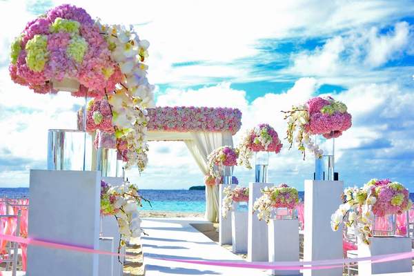
A wedding can have beautiful flowers, elegant invitations, and thoughtful table settings yet still feel disconnected. Often, the missing piece is a clear color plan. The best wedding color palette ideas create a visual thread from the first invitation to the final reception photographs.
That does not mean every detail must match. Variation makes a celebration feel natural. The goal is to choose a small family of colors, decide where each belongs, and let your venue, season, and personal style shape the result.
Start With the Setting, Not a Color Chart
Before saving dozens of wedding color schemes, study your venue. A room with timber floors and gold chandeliers responds differently to color than a white-walled loft or garden surrounded by greenery. Existing surfaces become part of your palette whether you planned them or not.
Consider the time of day. Pale blush may glow outdoors in morning light but disappear against cream linens in a dim ballroom. Jewel tones can bring depth to evening receptions. Ask for venue photographs taken during the same season and at a similar hour to your celebration.
Give Each Shade a Job
Try one main color, one supporting color, and one restrained accent, backed by a neutral such as ivory or taupe. This is a useful planning method, not a strict formula. Your main shade might appear in flowers and stationery, the supporting shade in napkins and attire, and the accent in ribbons or candles.
Imagine a stone courtyard wedding followed by dinner beneath olive trees. Sage green could connect the foliage and outfits; soft peach could appear in flowers; ivory could anchor menus and tablecloths. A few brass details would add definition without introducing another competing color.
Wedding Color Palette Ideas for Different Atmospheres
Think about how you want guests to feel rather than choosing colors simply because they are fashionable. These combinations offer wedding palette inspiration for different styles and settings.
Sage Green, Ivory, and Champagne
Soft green pairs well with botanical arrangements and understated interiors. Let ivory cover large surfaces, use sage in foliage and fabric, and add champagne through candleholders or stationery. Slight differences between natural green tones help the setting feel relaxed rather than overly coordinated.
Terracotta, Peach, and Warm Cream
For a courtyard, barn, or autumn celebration, terracotta brings warmth while peach keeps the mood light. Consider terracotta napkins, peach-toned flowers, and cream menus. Avoid making every item rust-colored; lighter pieces give the stronger shade room to breathe.
Dusty Blue, Slate, and White
This combination suits coastal settings and traditional venues. Dusty blue can feature in wedding party attire, deeper slate in printed details, and white in flowers and linens. Natural wood or clear glass prevents the scheme from looking too cool.
Burgundy, Plum, and Candlelit Ivory
These rich wedding colors suit intimate evening celebrations. Burgundy flowers and plum textiles add depth; ivory candles and place cards keep tables inviting. In compact rooms, reserve the darker shades for selected details rather than covering every surface.
Black, Ivory, and Soft Green
Black-and-ivory styling can feel striking without looking severe. Use black for typography, suits, or slim candleholders; let ivory dominate the tables; and add greenery for movement. This works especially well when the venue has interesting architecture worth highlighting.
Lilac, Butter Yellow, and Cream
A cheerful choice for a spring garden wedding, this pairing need not look overly sweet. Combine muted lilac flowers, a few pale yellow blooms, and cream linens. Repeat colors in small touches rather than giving them equal weight everywhere.
Carry the Palette Across the Celebration
Cohesion comes from repeating recognizable tones at key moments, not purchasing identical accessories. Focus first on what guests notice most: the ceremony backdrop, wedding party attire, reception tables, and printed pieces.
Flowers and Attire
Ask your florist which blooms and foliage are reliably available on your date. Flowers rarely match digital swatches exactly, so embrace natural variations. When outfits come from different retailers, compare actual fabric samples in daylight rather than relying on screen photographs. Similar undertones matter more than exact matching.
Stationery and Signage
Invitations introduce the mood without needing to display every shade. Carry a familiar color into programs, seating charts, menus, or place cards. Prioritize contrast: dark lettering on a light background is easier to read than faint text on patterned paper. For related inspiration, explore wedding invitation design ideas.
Reception Tables and Lighting
Large expanses of fabric influence the room more than tiny favors. Choose linens first, then test napkins, flowers, plates, and candles together. For practical reception color ideas, photograph a sample place setting from seated eye level. If objects compete for attention, remove a color before adding more decorations. Wedding table centerpiece ideas can help you refine the arrangement.
Test the Palette Before Committing
Create a small physical sample board with fabric, ribbon, paper, and photographs of available flowers. Place it beside a photo of the venue. Check samples in daylight and warm indoor lighting, especially if your reception continues after sunset. Finishes also affect the atmosphere: silver tends to feel cooler, while brass adds warmth.
Make a checklist of where each shade appears. If an accent occurs in only one isolated item, repeat it subtly elsewhere or remove it. If it dominates every surface, scale it back. A guide to wedding decor planning tips can help with coordinating the remaining details.
Share the same reference sheet with your florist, stationery designer, rental company, and attire suppliers. Include physical samples when possible: color names such as “dusty rose” can describe noticeably different shades across vendors.
Frequently Asked Questions
How many colors should a wedding palette have?
Two or three featured colors plus a neutral work for many celebrations. Tonal variations are welcome, but give each shade a recognizable role.
Do bridesmaid dresses and flowers need to match exactly?
No. Compatible undertones and a shared overall mood generally look more natural than exact matching. Related shades can give floral arrangements depth.
Can wedding colors change between ceremony and reception?
Yes. Keep one connecting neutral or main color, then deepen an accent for evening. Daytime peach might become richer terracotta at dinner.
What if the venue already has strong colors?
Treat carpets, walls, and furniture as part of the design. Choose complementary shades and bring in neutral linens or simple florals to balance busy areas.
Make the Colors Feel Like Yours
A cohesive wedding is not one where every ribbon, dress, and flower matches perfectly. It is one where the choices feel connected. Begin with your setting, select colors with distinct purposes, test them in real light, and repeat them thoughtfully. The strongest palette leaves room for personality and for moments that matter more than decorations.