

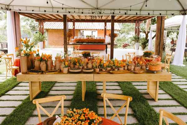
A terracotta wedding theme feels warm without being overly formal, colourful without becoming loud, and romantic without relying on pastel pink. Inspired by sunbaked clay, the look combines rusty orange, soft cream, muted blush and fresh greenery. The secret is not to make everything orange. Give terracotta natural textures and gentle neutrals, and the celebration will feel beautifully connected.
Build an Earthy Wedding Palette That Has Room to Breathe
Start with three main colours: terracotta, off-white and leafy green. Add blush or muted peach for a softer finish. Deep rust gives the scheme definition, especially in autumn, while sandy beige keeps a summer wedding light.
Let cream or ivory cover roughly half of what guests see, use terracotta in selected statement pieces, and leave space for greenery and natural wood. These are flexible proportions, not rules. They simply prevent richly coloured runners, flowers and backdrops from competing for attention.
Terracotta wedding colours change noticeably in different light. Fabric labelled “rust” may look brick red indoors, while clay ribbon can look peachy outside. Compare physical samples beside your venue’s flooring and walls before committing to rentals or dresses.
Choose Materials That Make the Colours Feel Natural
A convincing clay wedding theme depends as much on texture as colour. Matte ceramics, washed linen, timber, handmade paper and woven baskets echo real terracotta. Choose one or two dominant textures. At a countryside venue, linen and wood can lead, with ceramic vessels as accents. In a modern space, smooth pottery and simple napkins will feel more intentional.
Too many burlap, macramé, rattan and dried-grass pieces together can make an elegant setting look cluttered. Natural doesn’t have to mean rustic.
Create a Ceremony Setting with One Strong Focal Point
Rather than placing decorations everywhere, concentrate your ceremony budget at the altar. An asymmetrical arrangement of rust blooms, cream flowers and trailing greenery can frame the couple without hiding them.
For an outdoor ceremony, group terracotta pots of different heights near the entrance or along the aisle. Use stable vessels, and keep walkways clear. If the venue already has a beautiful brick wall, olive tree or garden backdrop, let it do part of the decorating. An earthy wedding palette often looks strongest when the setting shows through.
Give Reception Tables a Layered, Collected Look
Let the tableware provide contrast
Imagine a long wooden table with an ivory runner, white plates, amber glassware and folded rust napkins. Add low arrangements of cream and muted orange flowers in clay vessels, with olive or eucalyptus foliage. The neutrals calm the scene, the pottery brings warmth, and greenery keeps everything fresh.
For round tables, one generous floral arrangement may look cleaner than several unrelated objects. Keep sightlines open so guests can talk comfortably. If you use candles, choose secure holders and follow the venue’s flame restrictions; battery-operated options can be just as atmospheric.
Use rust wedding decor selectively
Rust runners, napkins, menus and chair ties on the same table can feel heavy. Choose one prominent fabric accent and repeat its colour in something small, such as menu typography or a flower. A collection of wedding table centrepiece ideas can help you adapt this approach to different table sizes.
Plan Flowers Around Shape, Season and Availability
Terracotta arrangements need not be entirely orange. Cream garden roses, peach ranunculus, rust dahlias, apricot blooms and airy greenery offer a balanced mix. Celosia adds velvety texture, while dried grasses introduce movement. Availability varies by season and location, so ask your florist about substitutes rather than insisting on a particular flower.
Mix rounded flower heads with looser stems. An all-orange bouquet may blend into terracotta bridesmaid dresses; ivory flowers and green leaves give both elements definition in photographs. Dried flowers can suit prepared installations, but they may shed and should be kept away from open flames.
Carry the Theme into Stationery and Personal Details
Off-white textured invitations with clay-coloured typography and a restrained botanical illustration set the mood. A rust envelope or subtle wax seal creates contrast without making every element identical. Repeat the same typefaces on welcome signs, seating charts, menus and table numbers.
For attire, consider varied dresses in cinnamon, soft clay and dusty rose rather than searching for an exact colour match. Bouquets with a shared cream-and-green foundation can tie everything together. If you want to compare colour combinations, wedding colour palette ideas offer other ways to balance rust with neutrals.
Adjust the Mood to Your Venue and Season
This is not exclusively an autumn look. For spring, combine light clay with blush and fresh green. In summer, favour ivory linens and airy flowers. Autumn suits deeper rust, while winter can handle richer brown accents and warm lighting.
Picture a reception in a bright, white-walled conservatory. Instead of covering every surface with orange, choose cream tablecloths, terracotta napkins and potted olive greenery. Repeat rust on the welcome sign and in a few floral stems. The result is clearly earthy, but the glass, daylight and foliage still play a part.
At a barn venue, pull back on timber details because the building already provides them. Beside the coast, lighten the scheme with sand and ivory instead of introducing dark brown.
Bring the Look Together Without Overspending
Choose three priorities before ordering: perhaps ceremony flowers, reception tables and stationery. Repeat a small set of colours and materials, and let less visible areas stay simple. Reusing ceremony arrangements at the reception may also save money if your florist can move them safely and on schedule.
Test one complete place setting at home or with a rental supplier. Photograph it in daylight and warm indoor light, then remove anything unnecessary. This rehearsal is often more useful than buying another box of decorations. Rustic wedding ceremony decor ideas can also suggest places where natural features replace purchased props.
Final Thoughts
The appeal of terracotta lies in its balance: warmth beside softness, earthy colour beside fresh green, and tactile details beside open space. Choose a restrained palette, use texture with intention, and concentrate your strongest styling moments where they matter. That creates a celebration that feels personal rather than themed from floor to ceiling.
Frequently Asked Questions
What colours go best with a terracotta wedding theme?
Ivory, cream, sage or olive green, blush and sandy beige complement terracotta beautifully. For contrast, introduce dark brown or deeper rust in small amounts.
Is terracotta suitable for a spring or summer wedding?
Yes. Use lighter clay tones, more cream and fresh greenery for an airy result. Reserve heavier rust fabrics for a moodier effect.
How can I create this look on a budget?
Focus on napkins, simple stationery and a few well-placed floral arrangements. Rent neutral vessels, reuse suitable ceremony flowers and avoid decorating every corner.
Do bridesmaid dresses need to match the decorations exactly?
No. Complementary clay, cinnamon or dusty rose shades can look more natural than exact matches. Consistent bouquets will connect the different tones.